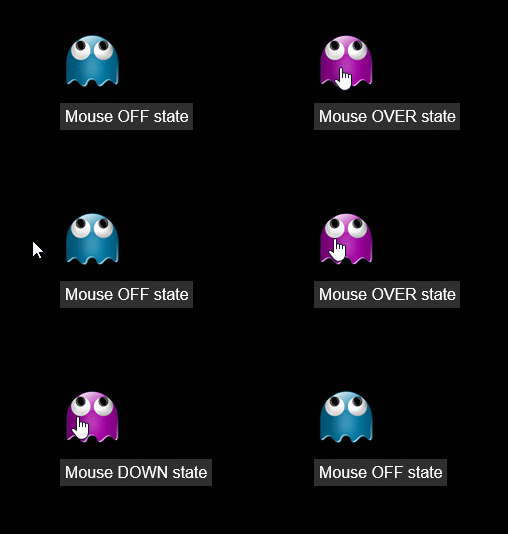
Button meter
Meter=Button displays a button with normal, hover, and pressed states.
Options
- General meter options
-
All general meter options are valid, except
WandH. - General image options
-
All general image options are valid for
ButtonImage, exceptImageCrop, andImageRotate. ButtonImage-
Path to the button image. The image should have 3 frames laid out either either horizontally or vertically (the orientation is determined by the width and height of the image). The first frame corresponds to the normal state, the second to the clicked state, and the third to the hover state.
See also: Button Images ButtonCommand-
Action to execute when the button is clicked.
Note: Similar toLeftMouseUpAction. The difference is thatButtonCommandignores transparent pixels in the image at all times, whereLeftMouseUpActionwill only ignore clicks on transparent areas if there is not some other meter behind the image.
Example
[Rainmeter] |
