Tooltips
Creates a tooltip which appears when the mouse is hovered over the meter.
Options
ToolTipTextRequired-
Text to display. This option provides the content for the tooltip, and is required.
Values from
MeasureNamefrom the meter can be used with%1,%2etc. as appropriate for various meter types:- String, Line, Image:
%1,%2,%3, ... - Histogram:
%1,%2 - Others:
%1
Notes:
To wrap the text on multiple lines, use the #CRLF# variable.
There are no text formatting options possible with ToolTipText. The font, colors and sizes are the ones built into the standard tooltip behavior in the Windows operating system.
On a String meter, numeric formatting options are forced to
AutoScale=1,Scale=1,NumOfDecimals=0,Percentual=0on the tooltip when values from the meter are used with%1,%2etc. To have more control over numeric formatting, [SectionVariables] should be used instead. Be sure to useDynamicVariables=1on the meter when section variables are used. - String, Line, Image:
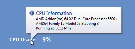
ToolTipTitle-
Title of the tooltip. Only one line of text can be used.
ToolTipIcon-
Specifies the icon to use for the tooltip. This can be the path to an .ico file, or one of the following preset icons:
InfoWarningErrorQuestionShield
Note:
ToolTipTitlemust be specified to useToolTipIcon. ToolTipTypeDefault:0-
If set to
1, a balloon tooltip is displayed. Otherwise a normal tooltip is displayed. ToolTipWidthDefault:1000-
Maximum width for the tooltip. When the width is reached, the text will automatically wrap.
Note: As a
ToolTipTitlecannot be wrapped, do not set this width less than the length of the title, or there could be unexpected results. ToolTipHiddenDefault:0-
If set to
1, the tooltip is not displayed.Note: This option can also be used in the [Rainmeter] section to hide all tooltips in the skin.
Example
[Rainmeter] |
An example skin demontrating the Tooltip option.